Category Archives: art

My Grandmother’s Quilt

IMG_0861   In the popular imagination, there has long been a romanticized picture of quilting as “quilting bees” in which ladies gathered, gossiped, and used their genteel skills to create colorful quilts. Folk art aficionados and museums have elevated quilts made for everyday use into works of art and the market for vintage quilts has gone through the roof in recent decades.

Quilts are works of art but lost on many are the practical utilitarian reasons for quilts to exist in the first place. As beautiful and artful as quilts may be, they were used to keep us warm and most of the people – mostly women – who created them were creating them as part of their job to feed and clothe and look to the comfort of their families. As beautiful as many quilts are and as much pride as is shown in the careful and intricate construction of quilts, their exhibition and appeal to collectors was far from the motivation for the quilter. More likely the motivation was along the lines of Will it keep the family warm at night? and Will it hold up? and Will I be embarrassed for the neighbor ladies to see it hanging on my clothesline?

As a child, I was fascinated with the quilts that would come out of the chiffarobes and cedar chests and closets when the nights started to become cool in the fall. The intricate patterns and pieces of fabric told a tale of the maker and her family. As I became older, my mother would occasionally offer me quilts that she had from her or Dad’s families. I have never turned down the gift of a quilt and now have a small but precious collection.

I am always curious about the provenance of the family quilts I receive but, because of the nature of the pieces and their creation, the information is often sketchy. These quilts, after all, were not made to be passed down as heirlooms. They were made to cover people and beds and serve a purpose. I have quilt tops that never got quilted and at least one quilt attributed to Snow Patton Journey, one of my paternal great-grandmothers.

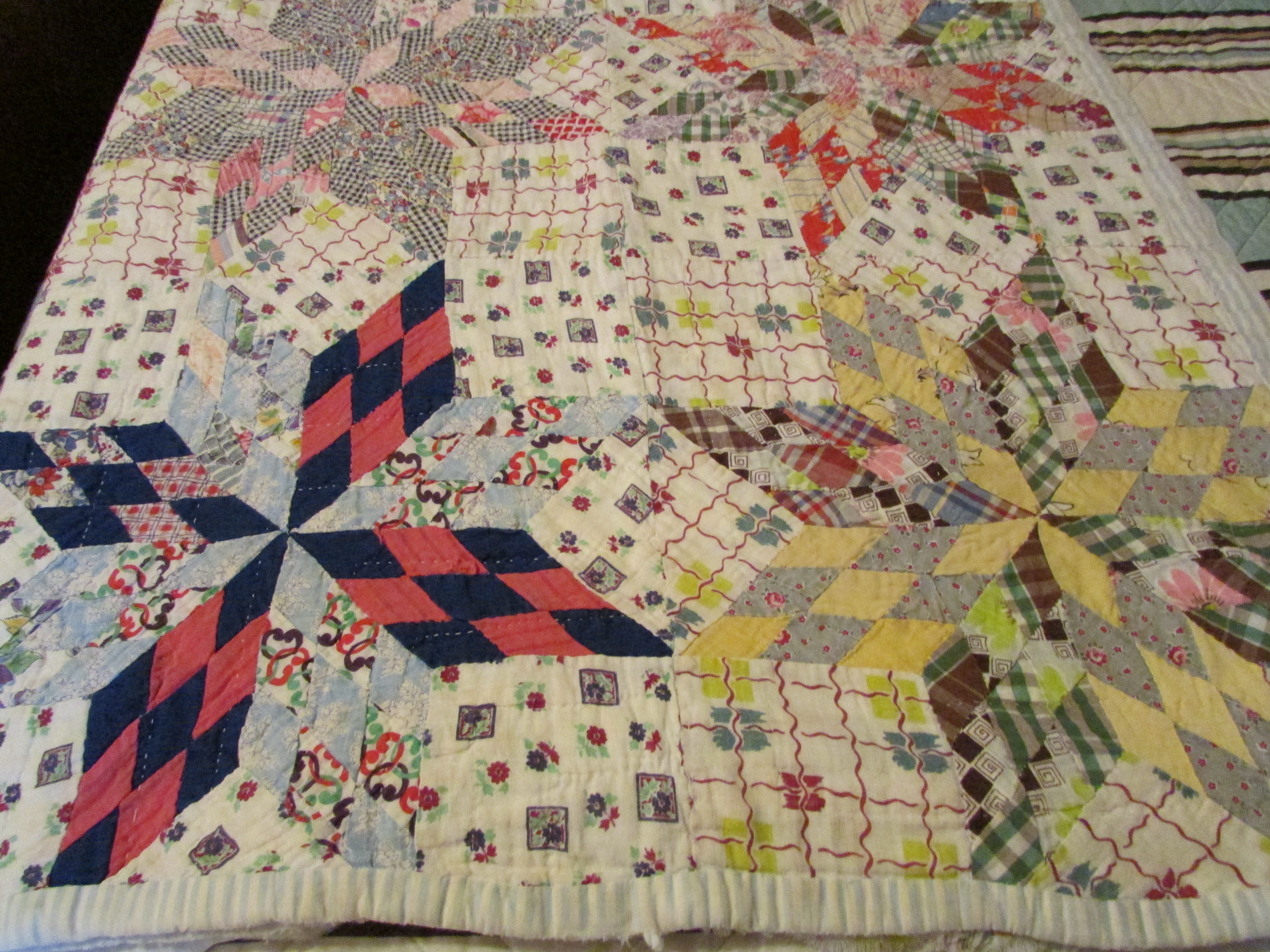
Most of the quilts I have, however, were made by Eula McCarn Harbison (1909-1995), my maternal grandmother. All but one of Grandmother Harbison’s quilts are traditionally patterned –star and snowflake forms are popular – and delicately and masterfully structured. There is one exception and that quilt is on my bed as I write this and has been on my bed every cold season for years. This exception is one that my mother gave to me with the disclaimer that “your grandmother would be horrified if she thought anybody would see this one.”

I hope Grandmother Harbison is not horrified when I say that this is my favorite quilt and I am proud to show it to others. It is clearly a “crazy quilt,” with unmatched and large pieces of fabric and no patterning. In examining it, my guess is that it was put together very quickly (perhaps in advance of an approaching cold spell?). It is also the heaviest and warmest quilt I have ever encountered. I don’t much like cold weather but one of the few pleasures of “the weather of northern aggression” is knowing that I will be sleeping under this amazing quilt for a while. My mother can’t remember when this quilt was made but I am guessing the 1940s before Mother’s family relocated to Birmingham after World War II. Mother says that’s a good guess since she doesn’t recall Grandmother quilting after the move to Birmingham.

IMG_0857

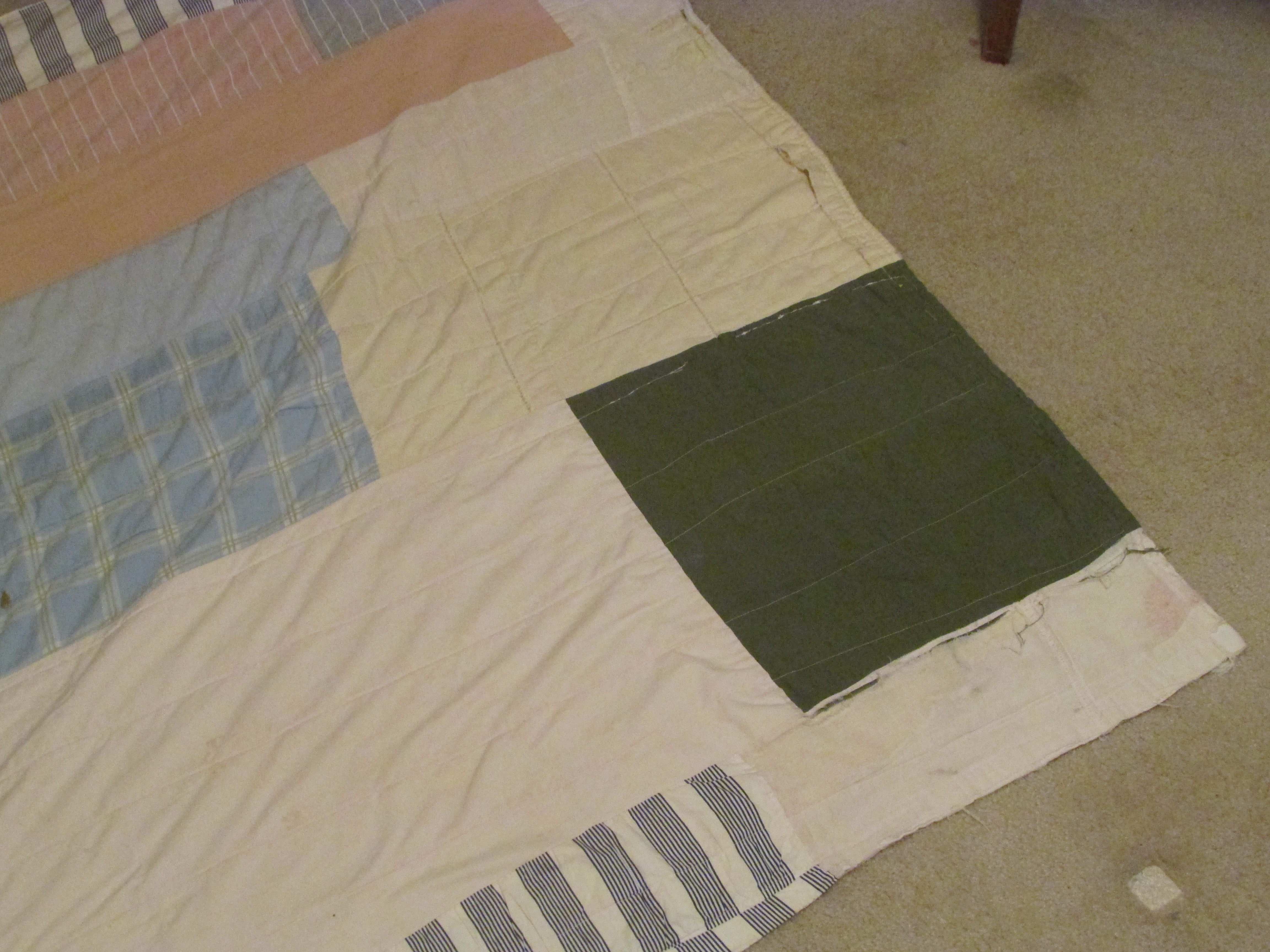
As an artist and as a lover of art, my tastes often run toward the modernist and minimalist and Grandmother Harbison’s quilt fits in both categories in its abstract and random collection of fabrics and in its asymmetrical and challenging composition. There is a large square of solid olive fabric placed near one of the corners that always reminds me of the blocks of color or text found in some Asian prints. This would not have been something my grandmother necessarily knew about but the artistic impulse and prescience intrigues me. Grandmother always said that every room should have a touch of red somewhere and I always thought Well, she and Diana Vreeland have that in common! 

One of Grandmother’s “nicer” more traditional quilts lives on the foot of the bed in my guest room but it’s the thick and crazy one that will cover me tonight and for many nights to come.

IMG_0870

(All quilts shown are by Eula McCarn Harbison.)


Christenberry: Bearing Witness

IMG_0838  I have had a couple of opportunities to hear artist William Christenberry speak and on each occasion he recounted how his mother worried that, based on his work, people would think that Alabama was just some “rusted out, worn down, bullet-ridden place.”

Christenberry’s work focuses on memories of a fading South and his photographs capture buildings and landscapes in decay. He often photographs the same places year after year and documents how places evolve or disappear or ultimately break down completely.

One such sequence, the “Palmist Building” series begun in 1961, is among Christenberry’s iconic images. The earliest photographs of the building show an abandoned and dilapidated wooden structure. A sign advertising a palmist has been placed upside down in a broken window as protection from the weather. Subsequent images over years show the progression of the building’s decay amidst growing vegetation. In the later images, the building is completely gone, and trees, vegetation, wire fencing, and a utility pole stand beside a lonely road. Similar photographic series include “Church, Sprott, Alabama,” “Green Warehouse,” and “Coleman Café.”

I have never shared Mrs. Christenberry’s concern about her son’s work, but she addresses a basic misunderstanding of the South by people who don’t really know the place. By capturing fade and decay, Christenberry is preserving images of a South that is disappearing … has largely disappeared. His predilection for finding and recording old buildings, abandoned places, overgrown landscapes – a predilection I share and which makes Christenberry’s work special to me – is driven by a need to bear witness rather than by nostalgia. Christenberry focuses on rural landscapes but the impulse seems to me to be the same as my attraction to rust and industrial decay found in urban environments. Some misinterpret these images as representations of what the South is today but Christenberry captures and honors them as a rapidly disappearing landscape.

William Christenberry was born in 1936 in Tuscaloosa and left Alabama in 1961 to live and work in New York, Memphis, and finally Washington, D.C. where he has lived and taught at the Corcoran since 1968. Still, his preferred landscape for his art focuses on the environs of Alabama’s “Black Belt,” an area of rich black soil that cuts through the center of the state, where both sets of his grandparents resided. Hale County, “ground zero” for Christenberry’s art, was also the location for James Agee and Walker Evans’s iconic Depression-era book, Let Us Now Praise Famous Men, a hypnotic and microscopic examination of the lives of three Alabama tenant farm families.

Occasionally, as I drive around the Black Belt in west Alabama, I will accidentally stumble across a place that Christenberry has photographed. I am startled at the discovery, stunned at the recognition, and often feel like I have witnessed some elusive ancient treasure.

Christenberry’s art encompasses painting and drawing, sculpture, and assemblage but he is primarily known for his photography. It was photographer Walker Evans himself who became a sort of mentor to Christenberry when they met in New York in the early 1960s after Christenberry finished his M.F.A. at Alabama. Evans steered Christenberry along the path of a concentration on photography after viewing snapshots Christenberry had made with a cheap Brownie camera as studies for expressionist paintings.

Often, in his sculptures, Christenberry takes the same buildings he has photographed and does three-dimensional reproductions of them, often resting on an authentic bed of Alabama red clay in a shallow box. Over time, these more realistic depictions have given way to solid white “dream buildings” and ghostly structures drawn from memory and iconographic imagery – ladders, gourds, signs, structures on stilts. Christenberry’s evocative art never tells the viewer what to think; he presents it and allows one to ponder and meditate on it, to explore the implications.

There are many books of Christenberry’s art available. These would be of interest to the uninitiated as well as those who already know the artist’s work. A couple of my favorites are Trudy Wilner Stack’s Christenberry Reconstruction: The Art of William Christenberry (1996) and William Christenberry (2006) with thoughtful essays by Walter Hopps, Andy Grundberg, and Howard N. Fox.

My articles about William Christenberry and Walker Evans with several multimedia links may be found at http://www.encyclopediaofalabama.org.

Community and Kentuck

IMG_0775   I never know what will catch my eye at the Kentuck Festival of the Arts in Northport, Alabama, right across the Black Warrior River from Tuscaloosa. It is always held on the third weekend in October (www.kentuck.org).

This weekend, October 18-19, was the 41st running of the Kentuck Festival. I began attending when the Festival was in its toddler stage, around #2 or #3. I’m not sure which one because, like turnip greens, Kentuck now seems ubiquitous in my life. Journalist and Columbia University professor Claudia Dreifus writes that Alabama is a “hotspot” for visual and musical art and that “Kentuck is an incubator, a nursery, a home.”

The festival started on a small local scale in 1971 and has grown in size and reputation ever since, frequently and nationally being touted as among the finest of its kind. Folk, self-taught, and visionary artists have always been the backbone of the Kentuck Festival but it includes a diverse and impressive array of visual artists from the South, throughout the United States, and beyond. The festival takes place in a wooded area of a park not far from Northport’s downtown but the Kentuck organization operates year-round with resident artists, studios, galleries, and workshops spread along Main Street and throughout the city.

Everything builds to the festival. Artists, dealers, patrons, and sightseers converge from all over the country to purchase, mingle, look at art, and meet the artists. Demonstrations, musical performances, storytellers, and food areas round out the sensory overload of the event. I counted more than 250 artist exhibitors in booths spread among towering trees. An added bonus was when I stumbled upon an art installation in an environment adjacent to the Festival grounds. Meredith Randall Knight’s M.F.A. exhibition, “The Marrow of It,” features nebulous concrete abstractions nestled within and interacting with a natural environment just steps from the festival.

IMG_0786

The sense of community is palpable and is one of the factors that always brings me back. Kentuck gives me an opportunity to visit with friends – many of whom I only see annually at Kentuck and some of whom I have known since I was an undergraduate at Alabama in the ‘70s. I can check out new directions in their art, find out how the art circuit has been this year, and catch up on the family.

Among those friends I count on seeing are Lou and Daniel Livingston. It’s always good to see Daniel’s bold works in clay, bright and shiny and delicate. Tim Weber, whose work I’ve followed and collected since he was in residence at Kentuck, is constantly creating new forms in his clay work as well as revisiting and fine tuning forms that he has been doing throughout his career. Close by Daniel Livingston’s area are Andrew and Etta McCall and their lovely little church structures and bird houses and free-form baskets.

T.R. Reid keeps creating whimsical and original whirligigs while his partner, Jeanie Holland, displays her colorful mixed media wares one booth over.

Folk pottery legend Jerry Brown has his face jugs on display among the exhibitors and the Miller family from Miller’s Pottery in Brent, Alabama, throws pieces as patrons look on. The Millers have roots going back to the early days of Alabama potteries.

Amos Paul Kennedy, whose letterpress shop used to be based in Alabama locations, has now relocated to Detroit, Michigan, but still sets up a press at Kentuck to produce his array of colorful and clever posters

I have pieces by all of the aforementioned artists in my home and living with their art is made even more special by knowing and interacting with the artists. Most of my pieces were purchased directly from the maker.

Charlie Lucas, the “Tin Man” and a legend in his own right, seems always to be hard at work on new sculptures in the rusting metal enclosure that houses his work at the festival. Steve Shepard’s outspoken and brightly colored paintings, often sprinkled with his unharnessed opinions on politics and other issues, are as entertaining as the animated conversations with the artist himself.

A new Kentuck discovery this year was Clay Bush, who makes amazing bags, wallets, backpacks, satchels, and other designs from repurposed automobile seatbelts. The structure of his designs is flawless and the execution is masterful

My main purchase this year was a copper and steel balanced wind vane by Allan Kress of the Alabama Forge Council. The finely wrought copper feather moves wistfully, dancing delicately with the breeze. I never know what will catch my eye at Kentuck and I never know, until I’m there, what I’ll be bringing home. For one weekend in October, a community of artists in Northport, Alabama, supplies positive and creative energy that will sustain and inspire me in the days to come.

IMG_0800

Mastery and Marginalia: The Art of Scott Smith

IMG_0734 I bought the first piece of art by Scott Smith that I ever saw. That statement is significant because I look at lots of art; however, I only buy a work of art when I find some connection that makes me long to possess it. I only buy art, in other words, that speaks to me in some way.

Scott Smith’s art speaks to me.

That first work that I acquired is called “Butterfly Wall” (pictured above). Like much of Scott’s art, “Butterfly Wall” combines found objects with prints on paper. A grizzled cracking piece of sturdy 4×4 with four rusty nails congregated near one end anchors the piece. On one side of the 4×4 is a slice of barely rusted tin with ridged edges top and bottom. On the other side of the 4×4 Scott has attached one of his stunning signature prints: in this case the metallic greys and dingy rust red inks blend and interact on paper that gracefully curves (I now know that the curving paper in “Butterfly Wall” is an anomaly in Smith’s work). “Butterfly Wall” has gravity and presence and looks as if it should be very heavy but it is really very light. I am sure he did not intend the print as a trompe l’oeil but everyone who sees “Butterfly Wall” for the first time walks over and touches the graceful curve and is surprised to discover that the print is, well, a print.

I knew Scott before I saw that first piece that I had to buy. I knew that Scott was a master printmaker and a mixed media artist and from our conversations I knew that we shared an affinity for some of the same types of art and artists. As Scott and I became friends I was pleased to learn that he has worked with some of those same artists we both admired.

And now that I have had the opportunity to observe much more of Scott’s output first-hand over the past decade I feel that his is a singular vision. Many artists work with found objects; many artists make prints; many artists incorporate assemblage into their work. And Scott Smith has some things in common with many artists. But his vision seems unique to me. I haven’t seen another artist’s work that is quite like this.

Scott is from the rust belt of Ohio and his fascination with industrial detritus is a fascination I share from growing up in Birmingham when it was still an iron and steel center. His concern with relics and castaways from the past never becomes sentimental or nostalgic. He recognizes the beauty in the margins and presents it at face value.

It’s not just the industrial castoffs Scott is drawn to, however. Scott’s art embraces the decay and fading grandeur of rural as well as urban landscapes. This is part of the reason, I suspect, that his output takes on a local and regional flavor regardless of where he happens to find himself. In the years that Scott and his wife, Michelle, have lived in northern Alabama he has rescued castaway barn materials, architectural elements, and other found objects and incorporated them into his work and allowed them to inform and influence his prints. Scott takes the objects at hand, filters them through his sensibility, and makes them of a specific time and place but still transcendent. He’s hard to peg and that is another reason I find his work so appealing.

“Aggressive,” “robust,” “masculine,” and “earthy” are adjectives I have applied to Scott’s work at different times. So I was a little skeptical a few years ago when Scott told me he was going to have a show at a small gallery in the idyllic Florida coastal community of Seaside. I am a somewhat grudging admirer of Seaside, Florida, and would be inclined to describe the town as “pastel,” “refined,” and “precious.” None of those are adjectives I would ever apply to Scott Smith’s work and I wasn’t sure how it would be received there.

I traveled to Florida with Scott, Michelle, and their daughter, Cecilia, for the Seaside gallery opening and was surprised and delighted to find that not only did Scott’s art “play” in that environment, it was embraced by it and embraced it in return. The work took on a whole new and unexpected presence in Seaside. Neither the environment nor the art was compromised. Instead, each responded with a fresh vibrancy and timbre.

That is the true mark of an artist and his art, isn’t it? Doesn’t it start with something personal and specific and of the moment and transform into something universal and transcendent? In Scott Smith’s work, the mastery and the marginalia fuse.

(See more of Scott Smith’s art at http://www.scottsmithfineart.com.)